
Whites: Sherwin Williams Top Paint Picks
Hey there, color enthusiasts! If you’re here, that probably means you’re getting ready for a painting project, or maybe you just like to stay in the loop on the best interior colors around. You also might be here because you have first-hand experience on how hard picking the right paint color can be, and trust us, you’re not alone!

Fortunately, we’ve designed hundreds of homes and have seen equally as many paint colors in action and are so excited to share with you our favorite, white & neutral Sherwin Williams paint colors.
Before we dive in, we want to share a few insights about when in the design process you should pick your paint color. When we design a space from scratch, we select the paint color after other finish options have been confirmed.
If you’re remodeling ALWAYS put paint on the walls after the construction phase is over. When the finishes are installed, the walls can get dinged up, so by waiting you’ll save yourself the headache of having to repaint.
If you’re not remodeling and plan to keep your current furnishings but want a fresh new wall color, then use your existing pieces to influence and guide your paint color selection. Lighting also plays a hugeeee role in how a paint color looks in a space so we recommend painting multiple color samples (or get stick-on samples) and live with them for at least a few days. This will allow you to see the paint in a different light throughout the course of the day. This is important because undertones might not be visible until late at night when you’re relying on artificial lighting in your room. This practice is a great way to protect your investment!
Our Top Picks

White and neutral paint’s ability to make rooms feel larger and brighter by amplifying natural light makes it a fan favorite for interiors. If you’re looking to create a space that’s fresh, airy, clean and calm then white might be the perfect choice! There are other colors that aren’t white but still have the same calming effect. Think of beige and grey. One could also argue that blues, greens and even blacks could be considered neutrals in certain spaces, but in this blog, we’re sticking to the basics. Keep an eye out for more blogs coming soon on our other paint color favorites!
Here’s a few reasons why you might want to choose white & neutral paint for your home:
Neutrals like whites, beiges and grays act as blank canvases that allow other elements in your room, like artwork, furniture, and textiles, to really shine!
They can also make spaces feel more cohesive, especially in homes with an open floor plan, by seamlessly linking different areas.
They are a great foundation for minimalist design, reinforcing a sense of simplicity and tranquility.
They’re often energy-efficient - especially whites! They’ll keep spaces feeling brighter without the need for added lighting.
They transcend design styles. We’ve used white in probably every design style you can think of. From coastal, to traditional, to modern, to Spanish, it everything in between.
So now let’s talk about the challenges with selecting paint colors. While all paint has undertones, white paint is notoriously difficult to select. Why? Because there is no real “true white” and trying to make sense of the massive range of undertones is enough to turn your brain to mush!
First, let’s break down exactly what is an “undertone.” Paint undertones are simply the subtle, underlying hues. While the color you see on the sample card might seem straightforward, the undertone becomes more apparent once the paint is applied to walls and exposed to different lighting.
Undertones can range across a spectrum of cool and warm hues. For example, white paint might have a cool undertone (like blue or gray) or a warm undertone (like yellow or pink). The right undertone can enhance the desired mood and aesthetic, making spaces feel warmer, cooler, or more balanced, depending on your goals.
Years ago, we went on a consultation and a client said she was trying to paint her walls white and after the paint dried, she realized that her walls were now…PINK! Yikes! But she was right, it was white with a strong pink undertone and she just didn’t realize. It happens! Fortunately, we’ve done the research and discovery for you and will share the undertones of each paint color.
Another aspect of a paint to consider is the LRV, or light reflective value. This refers to the percentage of light a paint color reflects. The lower the percentage, the less reflection while a higher percentage, like true white, reflects all light. We’ll be sharing the LRV for each color to help you understand how it will work in your space.
Now for the part you’ve been waiting for, our favorite white and neutral Sherwin Williams Paint Colors! Make sure you bookmark this page for your next design project and scroll all the way to the bottom for links to products that will make DIY painting a breeze.
OUR TOP WHITE & NEUTRAL PAINT COLORS
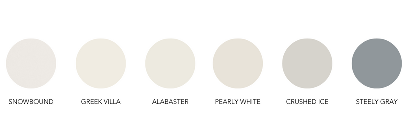
Seeing these colors against the true white background of this blog page might have you scratching your head thinking, “Ummmm…those are not whites.” Well, these are the undertones showing off! Keep going to see our project gallery, learn more about the properties of these paint colors and why we chose the colors we did for each of these spaces.
SNOWBOUND
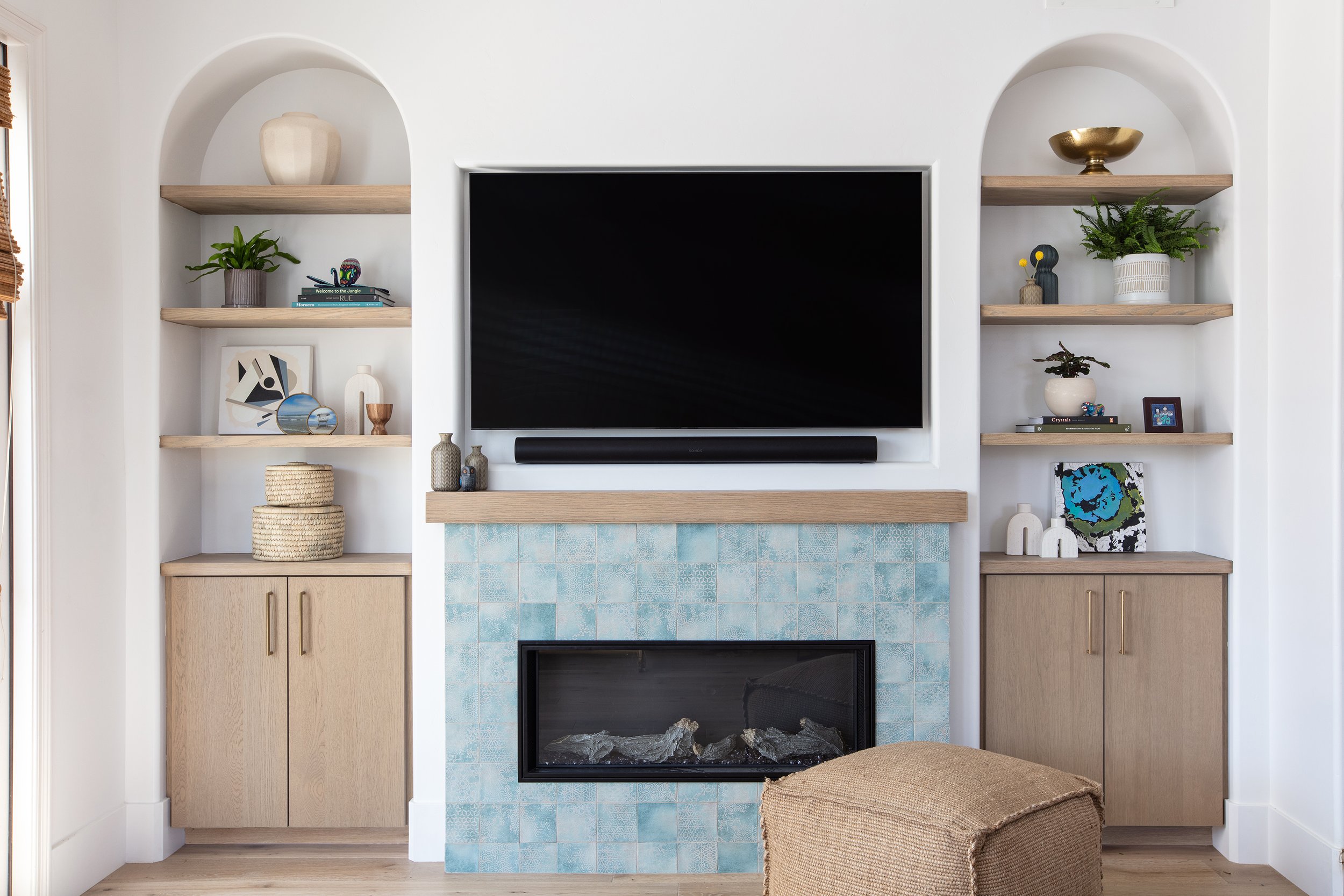
In this modern, Japandi-inspired living room, we sought to create a serene space by using natural wood tones and other organic materials. We also fell in love with this embossed ceramic tile, especially how it interacted with the white oak cabinetry. Japandi style is all about creating a minimal, balanced space, so we wanted the walls to add to that feeling while working well with both cool and warm tones. Snowbound is probably our most used white paint color because it’s one of the truest whites you can find and it feels crisp, clean and refined.
Undertones: Light gray
LVR: 83
Suggested Pairings: Autumn Orchard & Colonade Gray
Greek Villa
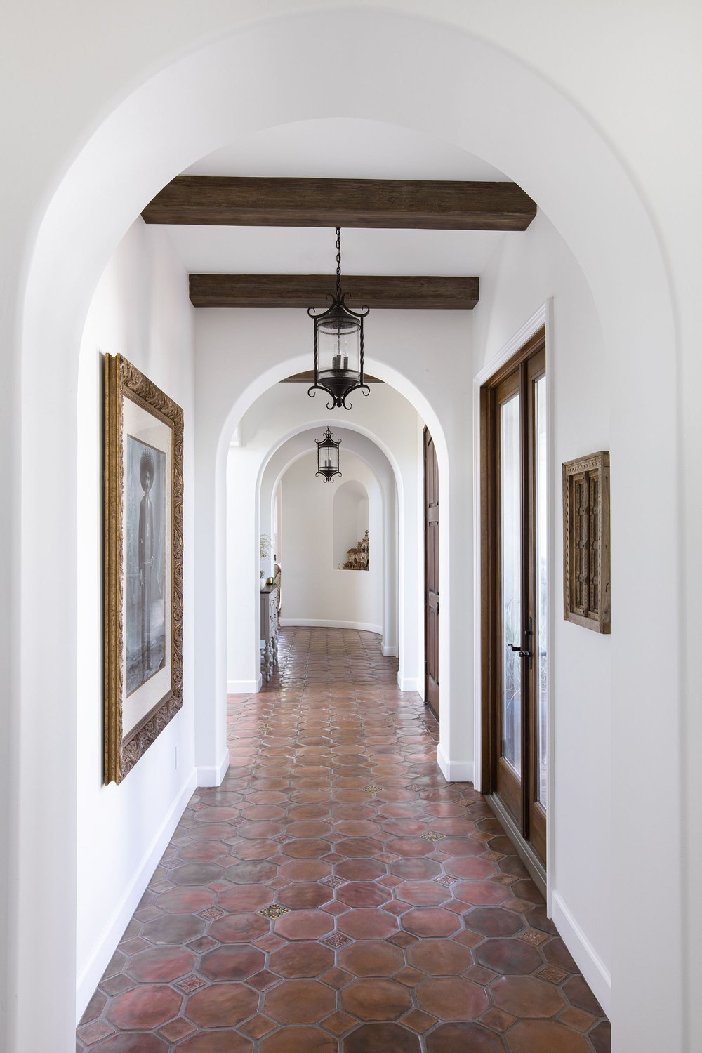
This is the perfect white for those looking to add a touch of warmth to their space. We chose Greek Villa for the entire downstairs of this Spanish-inspired home. According to Sherwin Williams, “this sunny white comes to life in natural light” and this project perfectly exemplifies that statement! We love the warm undertones of this color, the welcoming feel it provides and how it beautifully complements the Saltillo tiles and natural wood beams.
Undertone: Yellow
LVR: 84
Suggested Pairings: Illusive Green & In the Navy
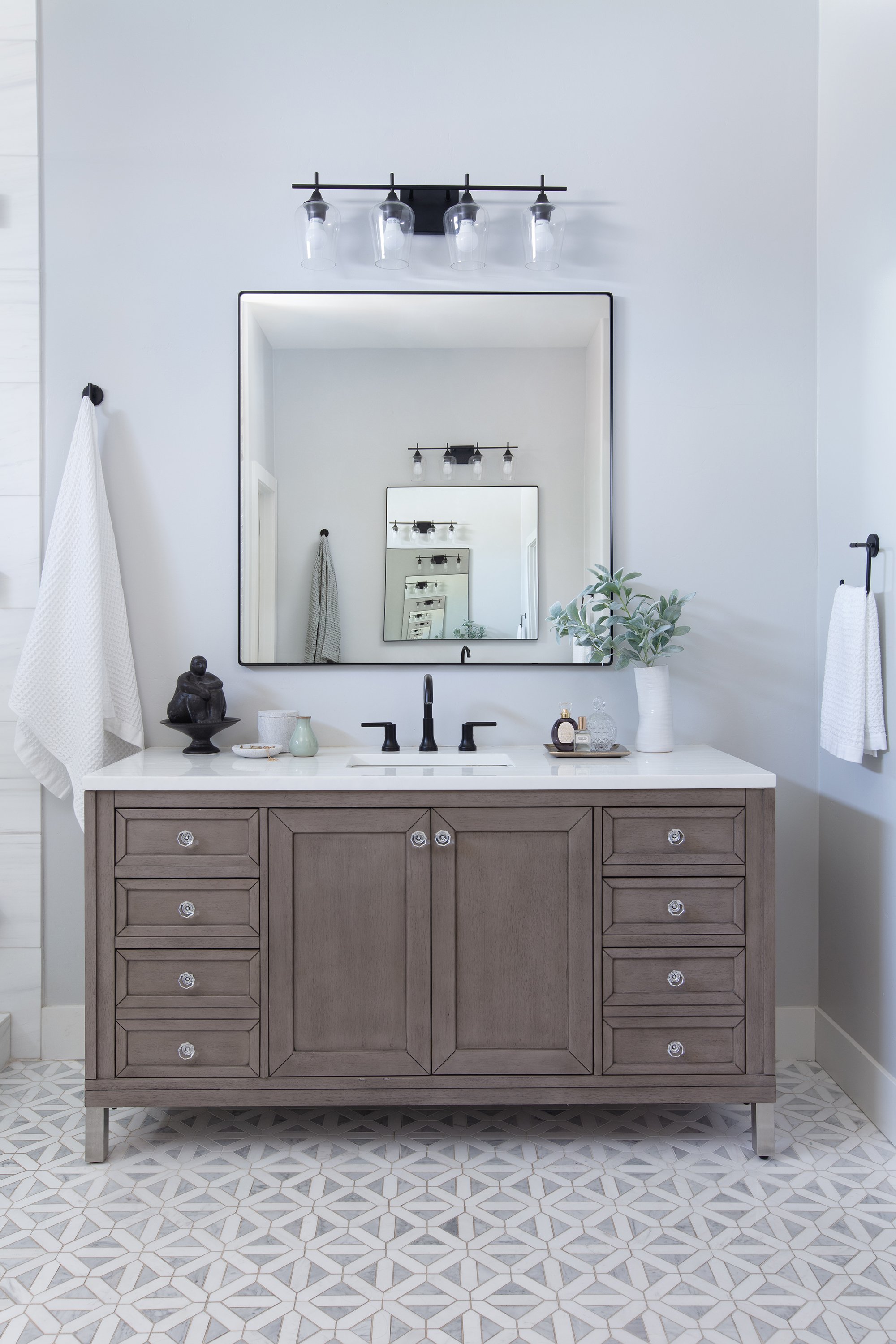
ALABASTER
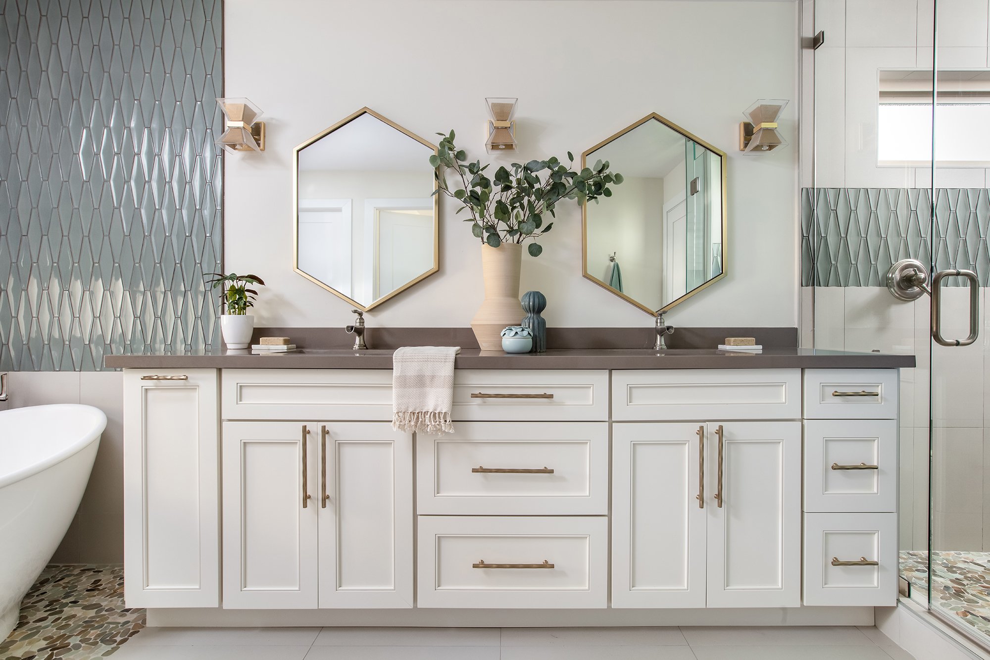
Another warm white paint color that we love is Alabaster. Alabaster is slightly darker than Greek Villa but will easily brighten up a space and works well with both warm and cool tones. We wanted this bathroom to feel light and airy while playing into the earthy tones in the pebble floor tile. Due to it’s greige undertones, it’s a versatile white that pairs well with warm and cool tones.
Undertone: Greige
LVR: 82
Suggested Pairings: Townhall Tan & Evergreen Fog
Pearly White

While slightly less reflective than some of the other whites, Pearly Gray is still a beautiful bright white and super versatile. Sherwin Williams says that these gray undertones “add a cool gentleness to this bright white.” These properties are why we chose it for this living room. It complemented the slate blue, gray, and charcoal tones in the room without making the space feel overly monochromatic.
Undertone: Gray
LVR: 76.5
Suggested Pairings: Jogging Path & Grapy
Shoji White
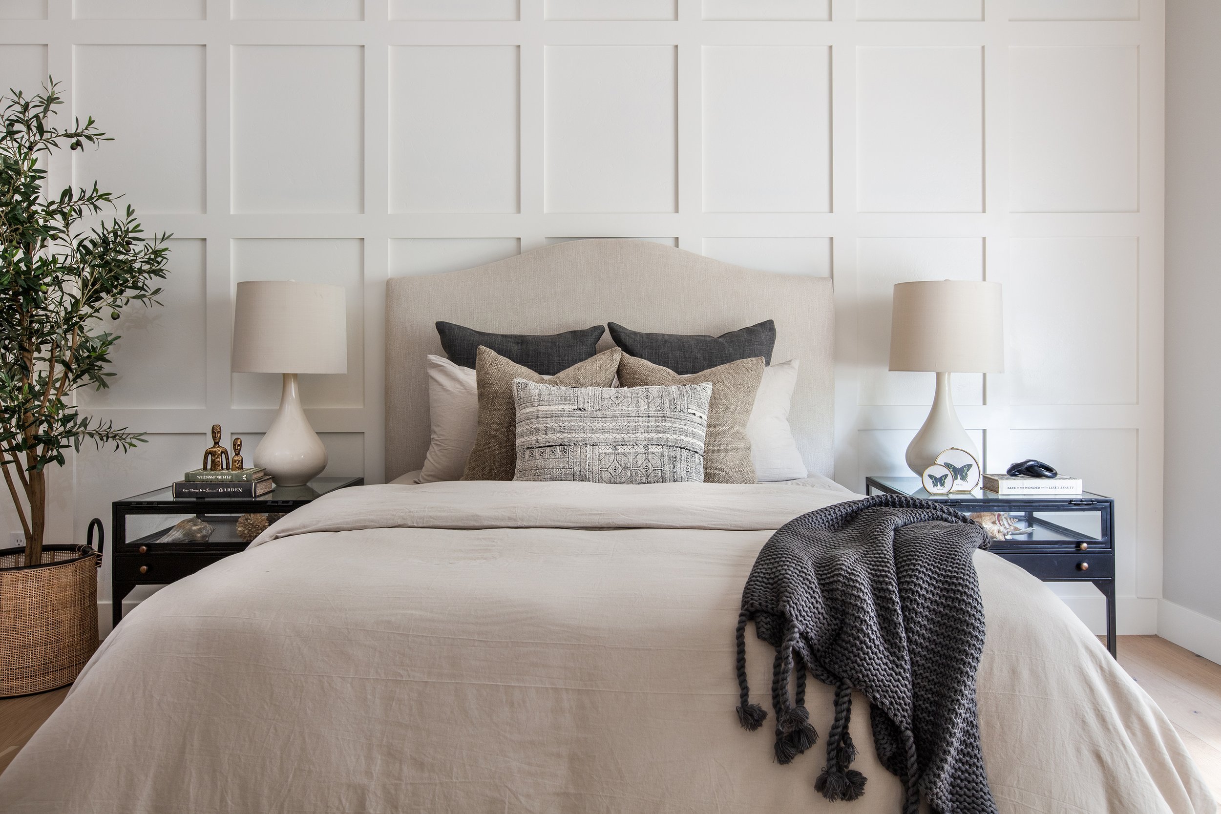
When you want it light but also super cozy, consider this option that Sherwin Williams calls “warm and creamy that borders on greige.” Compared to the other whites, Shoji White has a stronger and more saturated undertone and the lowest LVR, BUT it’s definitely still going to brighten a space!
In this guest room, you’ll find a sophisticated blend of natural materials like linen, cotton and chunky knits, whose colors all contribute to an earthy, organic vibe. We didn’t want a super bright white, as we wanted a more tone-on-tone feel to support that natural, warm & cozy feel. This color envelopes the room with comforting energy and we highly recommend it for bedrooms that feature good natural light.
Undertones: Cream & beige
LVR: 74
Suggested Pairings: Fawn Brindle & Perle Noir
Crushed Ice
This color is slightly illusive, sometimes appearing gray and other times feeling more beige, which is actually one of the reasons we love Crushed Ice much. This color, like many, seems to absorb the other colors and materials around it. In this bathroom, it adopts a lot of grays from the marble floors but still holds a certain warmth. This color is incredibly versatile and is great for bathrooms, living spaces and kitchens!
Undertone: Green & Gray
Suggested pairings: Mountain Road & Magnetic Gray
Well, there you have it! Our favorite white paint colors by Sherwin Williams. We hope you enjoyed reading this blog and found lots of helpful information and inspiration! Keep an eye out for more paint color blogs coming soon!
SHOP DIY PAINTING ESSENTIALS
Tackling your own painting project? Snag these must-haves!

Need more?
If you’re looking for specific advice about your space, give us a call for an in-person or virtual consultation!
This post contains affiliate links. If you purchase something we may earn a commission.